Posted on

Understanding Italian Anti Design 1960s: New Guide to Its Origins and Impact

Italian Anti Design 1960s

Table of Contents

  1. Introduction
  2. What Is the Italian Anti-Design Movement?
  3. Historical Context: Italy in the 1960s
  4. Key Characteristics of Anti-Design
  5. Influential Designers and Groups
  6. Design Philosophy Behind Anti-Design
  7. How Anti-Design Influences Modern Creative Work
  8. Recommended Fonts for Anti-Design Inspired Visuals
  9. Conclusion
  10. References

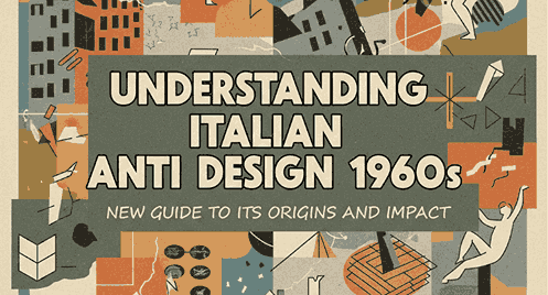
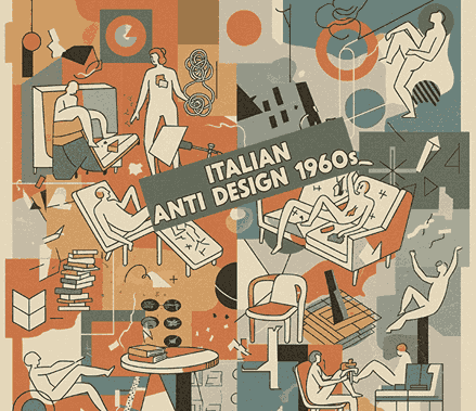
1. Introduction Italian Anti Design 1960s

Italian Anti Design 1960s movement was one of the most unconventional and rebellious eras in design history. Emerging as a reaction to the rigid rules of modernism, Anti-Design challenged the established ideas of functionality, harmony, and beauty. Instead, it embraced chaos, irony, exaggerated forms, bold colors, and playful contradictions.

This movement was more than a design style — it was a cultural statement. Designers in Italy used objects, furniture, and visual compositions as critiques of consumerism, conformity, and mass culture. Today, Anti-Design continues to influence graphic design, branding, packaging, and typography, especially within experimental and expressive fields.

In this article, we explore the roots, evolution, and impact of this revolutionary movement while also showcasing font recommendations from CalligraphyFonts.net to help you integrate Anti-Design aesthetics into your own visual work.

Italian Anti Design 1960s

2. What Is the Italian Anti Design 1960s Movement?

The Anti-Design movement began in Italy during the late 1960s as a counter-response to rationalist and minimalist design standards. While modernism valued simplicity, functionality, and order, Anti-Design celebrated:

  • Excess
  • Ornamentation
  • Playfulness
  • Irony
  • Bold colors
  • Unexpected shapes
  • Humorous cultural commentary

Anti-Design questioned:
“Why must design be functional, minimal, and serious?”

Instead of serving strict utility, design became a tool for communication, freedom, and expression.

3. Historical Context: Italian Anti Design 1960s

Italy in the 1960s was a place of social change, political tension, and cultural transformation. Key factors that shaped Anti-Design included:

1. Post-war economic boom

Industrialization increased mass production, influencing consumer culture and dissatisfaction with standardized products.

2. Growth of art movements

Pop Art, Radical Architecture, and avant-garde culture inspired designers to break norms.

3. Youth resistance and rebellion

A new generation challenged traditional values, leading to more experimental creative practices.

These cultural shifts set the stage for the rise of radical design groups who would redefine the meaning of design.

4. Key Characteristics of Italian Anti Design 1960s

Anti-Design had a distinctive visual language. Signature elements included:

1. Bold, contrasting colors

Vibrant reds, yellows, purples, and greens were used to shock and provoke.

2. Exaggerated shapes

Designers played with oversized, distorted, or playful forms.

3. Humorous and ironic compositions

Many Anti-Design objects mocked mass consumerism.

4. Rejecting functionality

Some objects were intentionally impractical — a deliberate protest against functionalist values.

5. Cultural commentary

Designers approached objects as tools to express political and social critiques.

6. Hybrid aesthetics

Mixing styles, periods, and textures in ways that were visually chaotic but conceptually rich.

This blending of rebellion and creativity is what makes the Italian Anti Design 1960s movement so timeless and influential.

5. Influential Designers and Groups

Several designers and collectives shaped the Anti-Design movement. The most notable include:

Memphis Group

Founded in the 1980s by Ettore Sottsass but rooted in the earlier Anti-Design philosophies. Their furniture used bright colors, geometric shapes, and unconventional patterns.

Archizoom Associati

Known for challenging modernist ideals, especially with their ironic “No-Stop City” concept.

Superstudio

Created intentionally impractical designs to critique consumer society and modernist architecture.

Gruppo Strum

Explored emotional forms in objects.

Ettore Sottsass

Father of postmodern design and one of the earliest critics of functionalism.

Each brought a unique perspective to the movement, but all shared the belief that design should provoke thought—not just serve a functional purpose.

6. Design Philosophy Behind Italian Anti Design 1960s

At its core, Anti-Design was a cultural rebellion. Its philosophy can be summarized through several principles:

1. Italian Anti Design 1960s as an expressive language

Objects were meant to communicate, shock, and even disturb.

2. Anti-functionalism Italian Anti Design 1960s

Designs didn’t have to be practical — sometimes the “uselessness” made the strongest statement.

3. Breaking aesthetic rules Italian Anti Design 1960s

Symmetry, order, and harmony were intentionally disrupted.

4. Questioning consumerism Italian Anti Design 1960s

Designers addressed themes such as mass production and disposable culture.

5. Encouraging debate

Anti-Design was purposefully provocative, pushing people to reconsider their relationship with objects.

These ideas made Anti-Design both controversial and groundbreaking.

Italian Anti Design 1960s

7. How Italian Anti Design 1960s Influences Modern Creative Work

Even though the movement began in the 1960s, its legacy continues to shape:

  • Graphic design
  • Branding
  • Poster design
  • Type design
  • Experimental layouts
  • 3D product visualization
  • Social media aesthetics
  • Interior and furniture design

Anti-Design’s rebellious visuals are especially popular in youth culture branding, music posters, streetwear packaging, and creative editorial layouts.

Designers today use Anti-Design principles to break monotony, add expressive personality, and challenge the overly clean aesthetics that dominate digital design.

8. Recommended Fonts for Italian Anti Design 1960s Inspired Visuals

Typography is a powerful way to capture Anti-Design energy. Here are fonts from CalligraphyFonts.net that reflect boldness, rebellion, and expressive visual language:

1. Overcame Font

Modern geometric sans serif with multiple styles (italic, bold, outline). Perfect for experimental layouts and disruptive editorial design.

2. Catcalling Font

Expressive, irregular, and full of attitude—ideal for chaotic, anti-system visual concepts.

3. Brownfield Font

A vintage serif with strong personality, suitable for contrasting old-meets-new anti-aesthetic compositions.

4. Baskara Display Grunge Font

Rough, distressed, and rebellious. Perfect for capturing the raw, anti-polish spirit of 1960s Italian radical design.

These fonts help designers recreate the spirit of rebellion that defined the Anti-Design movement.

9. Conclusion Italian Anti Design 1960s

The Italian Anti Design 1960s movement was more than a stylistic trend; it was a radical critique of traditional design values. By rejecting functionalism, embracing irony, and celebrating expressive chaos, designers of the era reshaped the identity of modern design.

Today, Anti-Design continues to inspire experimental visual work across various creative fields. Whether you’re designing posters, packaging, or digital layouts, integrating Anti-Design principles—with the help of expressive fonts such as Overcame, Catcalling, Brownfield, and Baskara Display Grunge—can add bold character and cultural depth to your creative projects.

10. References

  1. MoMA — Postmodern Design Overview
  2. Memphis Milano — History of the Memphis Movement
  3. Vitra Design Museum — Radical Design
  4. Britannica — Ettore Sottsass Biography
Posted on

Food Packaging Color Ideas: How to Choose the Perfect Palette for Your Brand 2025

Food Packaging Color Ideas

Table of Contents

  1. Introduction
  2. Why Colors Matter in Food Packaging
  3. The Psychology of Colors in Food Branding
  4. Popular Color Palettes for Food Packaging
  5. How to Choose the Best Color Combination for Your Food Product
  6. Font Recommendations for Food Packaging Designs
  7. Practical Tips to Strengthen Your Packaging Identity
  8. Conclusion
  9. References

1. Introduction

Food Packaging Color Ideas In the competitive industry, packaging plays a critical role in attracting customers and communicating your brand message. Colors are one of the strongest visual elements that influence perception, emotions, and purchasing decisions. This is why exploring Food Packaging Color is essential for creating packaging that stands out on store shelves, e-commerce listings, and social media.

In this article, we will explore the psychology behind colors, the most effective palettes for different types of food products, and practical tips for selecting the right colors for your own brand. We will also recommend several font styles from CalligraphyFonts.net that complement various food packaging themes.

Food Packaging Color Ideas

2. Why Colors Matter in Food Packaging Color Ideas

Color does more than simply make packaging look attractive—it conveys meaning and helps customers make decisions quickly. Studies in consumer psychology show that customers can form a judgment about your product within only a few seconds, and color is one of the main contributors to this snap decision.

Colors help communicate:

  • Flavor expectations
  • Freshness and quality
  • Target audience (children, adults, health-conscious buyers)
  • Brand personality
  • Product category (organic, gourmet, snack, beverages)

When done correctly, colors increase recognition, trust, and customer engagement.

3. The Psychology of Food Packaging Color Ideas in Branding

Here are some commonly used colors and the emotions or messages they create in food packaging:

Red Food Packaging Color Ideas

Associated with energy and appetite stimulation. Often used for snacks or fast food products.

Yellow Food Packaging Color Ideas

Creates warmth, friendliness, and attention. Great for children’s snacks or cheerful food branding.

Green Food Packaging Color Ideas

Represents freshness, health, and organic ingredients. Works well for vegan, healthy, or natural products.

Brown Food Packaging Color Ideas

Communicates warmth, coffee, bakery, chocolate, and earthy flavors. Ideal for artisanal and handmade products.

Blue Food Packaging Color Ideas

Often used for beverages or refreshing products. Also conveys trust and reliability.

Orange Food Packaging Color Ideas

Energetic, fun, and appetizing. Common in juice, snacks, or fruity products.

Black & White Food Packaging Color Ideas

Clean, premium, and modern — widely used for gourmet or luxury food brands.

Understanding color psychology helps you select a palette that matches your product category and audience.

4. Popular Palettes for Food Packaging Color Ideas

1. Fresh & Healthy Palette

  • Light green, leaf green, beige
  • Perfect for organic products, salad bowls, plant-based foods

2. Sweet & Dessert Palette

  • Pink, cream, soft brown, chocolate
  • Works for bakery goods, dessert drinks, snacks

3. Kids’ Snack Palette

  • Bright yellow, orange, red, playful purple
  • Appeals to young audiences and conveys fun

4. Bold & Spicy Palette

  • Deep red, black, metallic gold
  • Ideal for spicy sauces or bold-flavored snacks

5. Minimalist Premium Palette

  • White, charcoal, gold accents
  • Suitable for gourmet foods, specialty products, and premium beverages

Your color palette should visually represent your product’s personality and flavor profile.

Food Packaging Color Ideas

5. How to Choose the Best Color Combination for Your Food Product

Here are practical steps to create the right color combination:

1. Identify Your Product’s Flavor or Category

Different flavors correlate with specific colors—green for mint or organic, red for spicy, brown for chocolate.

2. Analyze Your Target Audience

Children prefer bright colors; adults may prefer clean and modern palettes.

3. Research Market Competitors

Look for trends in your category and identify ways to differentiate while staying familiar.

4. Consider Psychological Impact

Choose colors that evoke the feelings you want customers to associate with the product.

5. Test Multiple Mockups

Visual testing ensures your packaging is both attractive and readable at various sizes and distances.

6. Font Recommendations for Food Packaging Color Ideas Designs

Typography is just as important as color. The right font enhances your brand’s personality and reinforces flavor cues.

Here are recommended fonts from CalligraphyFonts.net for this article:

1. Mango Bite Font

A playful and tasty-looking font that is perfect for juicy, fruity, or snack packaging.

2. Gummy Candy Font

Cute, rounded, and energetic — ideal for candy, kids’ snacks, or colorful food packaging.

3. Avocado Diet Font

Clean, healthy, and modern. Excellent for food products targeting wellness and organic markets.

4. Caramel Pizza Font

Warm, bold, and delicious. Perfect for bakery, pizza, dessert shops, and artisanal products.

These fonts help enhance the packaging identity and make the product more memorable.

7. Practical Tips to Strengthen Your Food Packaging Color Ideas Identity

✔ Use contrast to ensure readability
✔ Keep your palette limited to 2–4 main colors
✔ Maintain consistency across packaging variations
✔ Ensure the colors match digital and print versions
✔ Combine typography + color strategically
✔ Use mockups to test shelf visibility

8. Conclusion Food Packaging Color Ideas

Choosing the right Food Packaging Color Ideas helps elevate your product branding and influences how customers perceive taste, quality, and value. With the right color psychology, a thoughtful palette, and well-chosen typography, your packaging can stand out visually and emotionally.

By pairing strong color choices with carefully selected fonts, such as Mango Bite, Gummy Candy, Avocado Diet, and Caramel Pizza, your food packaging design can become more engaging and impactful.

9. References

  1. Canva – Choosing Colors for Branding
  2. 99Designs – Food Packaging Design Tips
  3. Packaging of the World – Food Packaging Inspiration
  4. Din Studio – Color Combination Ideas for your Food Business
Posted on

Bitmap vs Vector Graphics: Understanding New Key Differences for Designers

Bitmap vs Vector Graphics

Table of Contents

  1. Introduction
  2. What Are Bitmap Graphics?
  3. What Are Vector Graphics?
  4. Key Differences Between Bitmap and Vector
  5. When to Use Bitmap Graphics
  6. When to Use Vector Graphics
  7. Common File Formats for Bitmap & Vector
  8. Why Designers Should Understand Both Types
  9. Best Fonts for Visual Mockups in Bitmap vs Vector Projects
  10. Conclusion
  11. References

1. Introduction

Bitmap vs Vector Graphics In the world of digital design, one of the most fundamental concepts designers must understand is the difference between bitmap and vector graphics. Whether you create illustrations, logos, UI assets, posters, or digital branding, knowing how each format works can dramatically improve your workflow and ensure better quality results.

This article breaks down Bitmap vs Vector Graphics in an easy, comprehensive way—perfect for beginners and professionals. You will also find font recommendations from CalligraphyFonts.net to help you create stunning visuals and mockups that match your design workflow.

Bitmap vs Vector Graphics

2. What Are Bitmap vs Vector Graphics?

Bitmap graphics—also known as raster images—are made up of a grid of tiny squares called pixels. Each pixel contains color information, creating the final image.

Characteristics of Bitmap vs Vector Graphics

  • Pixel-based
  • Resolution-dependent
  • Can become blurry when enlarged
  • Ideal for complex images like photos

Common Uses

  • Photography
  • Digital painting
  • Web graphics
  • Texture-heavy visuals

3. What Are Bitmap vs Vector Graphics?

Vector graphics are made using mathematical paths rather than pixels. This means shapes are defined by formulas, allowing the image to scale without losing quality.

Characteristics of Bitmap vs Vector Graphics

  • Formula/path-based
  • Resolution-independent
  • Scalable to any size
  • Ideal for logos, icons, and illustrations

Common Uses

  • Branding
  • Print materials
  • Icons & UI elements
  • Technical illustrations

4. Key Differences Between Bitmap vs Vector Graphics

Understanding the differences helps you choose the right format for each project.

1. Scaling

  • Bitmap: loses quality when enlarged
  • Vector: scales infinitely with no loss

2. File Size

  • Bitmap: typically larger
  • Vector: often smaller unless highly complex

3. Detail & Realism

  • Bitmap: great for detailed imagery
  • Vector: best for simple, clean shapes

4. Editing

  • Bitmap: edited pixel by pixel
  • Vector: edited by adjusting paths & nodes

5. Compatibility

  • Bitmap: universally supported
  • Vector: requires specific design software

5. When to Use Bitmap vs Vector Graphics

Bitmap is the best choice when working with:

  • Photographs
  • Texture-rich digital art
  • Realistic shading & gradients
  • Photo manipulation
  • Detailed backgrounds

Because bitmap graphics capture subtle color variations, they are ideal for visually rich projects.

Bitmap vs Vector Graphics

6. When to Use Bitmap vs Vector Graphics

Vector graphics are the top choice for:

  • Logos & branding
  • Icons & interface design
  • Typography & lettering
  • Posters, merchandise & print
  • Scalable illustrations

Vectors ensure your designs look sharp at any size—from business cards to billboards.

7. Common File Formats for Bitmap vs Vector Graphics

Bitmap Formats

  • JPG / JPEG – compressed, widely used
  • PNG – supports transparency
  • GIF – basic animation
  • TIFF – high-quality images

Vector Formats

  • SVG – web-friendly vector format
  • AI – Adobe Illustrator
  • EPS – print industry standard
  • PDF – scalable vector-compatible format

8. Why Designers Should Understand Both Types

Mastering both bitmap and vector workflows allows designers to:

  • Optimize images for print and digital platforms
  • Choose the right format for maximum clarity
  • Improve production efficiency
  • Collaborate better with printers and developers
  • Deliver professional-level results

Understanding these formats is essential in any creative industry—from UI/UX design to branding and illustration.

9. Best Fonts for Visual Mockups in Bitmap vs Vector Projects

To enhance the clarity and professionalism of your “Bitmap vs Vector” visuals or blog images, here are recommended fonts from CalligraphyFonts.net:

1. Faint Green Font

Perfect for clean layouts, diagrams, and explanatory visuals. The minimalist sans-serif style is ideal for comparing bitmap and vector formats.

2. Speed Attack Font

A bold, dynamic display font great for headers, titles, or infographic elements that require energy and modern appeal.


3. Pictorial Style Font

Ideal for labeling charts or creating eye-catching headings. Its stylish yet readable form works perfectly with technical design topics.

4. Monoscreen Modern Font

A futuristic and digital-feel font—excellent for tech-related mockups, UI/UX diagrams, and illustrations discussing digital formats.

Using these fonts in mockups or article graphics will help visually communicate the difference between bitmap and vector in a clean and engaging way.

10. Conclusion

Both bitmap and vector graphics play essential roles in modern design. Bitmaps are perfect for photos and detailed imagery, while vectors excel at scalability and clean, sharp shapes. Understanding these differences allows designers to choose formats wisely and deliver high-quality results for any project.

With the right fonts—like those from CalligraphyFonts.net—you can create striking visuals, infographics, and mockups that effectively reinforce the concepts behind each format.

11. References

Posted on

Streamline Architecture History: New Origins, Features & Influence

Streamline Architecture History

Table of Contents

  1. Introduction
  2. What Is Streamline Architecture?
  3. Historical Background: The Rise of the Streamline Era
  4. Key Characteristics of Streamline Architecture
  5. Influence of Industrial Design on Streamline Architecture
  6. Streamline in Modern Visual & Graphic Design
  7. Using Fonts to Illustrate Streamline Style in Design Projects
  8. Recommended Fonts for Streamline-Inspired Mockups
  9. Why Streamline Design Still Matters Today
  10. Conclusion
  11. References

1. Introduction

Streamline Architecture History — often called Streamline Moderne—is one of the most iconic design styles that emerged in the early 20th century. Recognized by its sleek forms, rounded edges, and aerodynamic aesthetics, this movement significantly shaped the design world. From buildings and transportation to graphic design and typography, Streamline’s influence continues to inspire modern creatives today.

This article explores the Streamline Architecture History, its core characteristics, and how designers can incorporate its visual philosophy into contemporary projects, including font usage.

Streamline Architecture History

2. What Is Streamline Architecture History?

Streamline architecture is a style that emphasizes smooth, flowing lines, curved forms, and a sense of movement. It was deeply inspired by machines and the aerodynamic principles seen in vehicles like trains, ships, and airplanes.

Unlike the sharp, geometric angles of Art Deco, Streamline Moderne softened the aesthetic to create more fluid and horizontal visuals.

3. Historical Background: The Rise of the Streamline Architecture History Era

The Streamline movement gained popularity during the 1930s and 1940s, particularly in the United States and parts of Europe. The Great Depression significantly influenced design sentiment—simplicity, efficiency, and functionality became priorities.

Many experts link the rise of this aesthetic to:

  • Industrial mass production
  • Advances in transportation technology
  • The cultural fascination with speed and progress

Streamline architecture became a symbol of optimism and modernity, showing that even in difficult times, design could embody hope and innovation.

4. Key Characteristics of Streamline Architecture History

Streamline architecture is easily recognized through its unique features, including:

✓ Horizontal Emphasis

Horizontal lines dominate the façade, creating a sense of speed.

✓ Rounded Corners

Curved edges imitate aerodynamic surfaces, similar to vehicles.

✓ Long Bands of Windows

Often called “ribbon windows,” these add continuity and visual flow.

✓ Smooth, Polished Surfaces

Materials such as stucco, chrome, glass block, and metal were common.

✓ Nautical Influence

Many buildings feature ship-like elements such as porthole windows, metal railings, and deck-inspired terraces.

✓ Minimal Ornamentation

Unlike Art Deco, Streamline architecture avoids heavy decoration, focusing on form and function.

5. Influence of Industrial Design on Streamline Architecture History

Streamline architecture is inseparable from industrial design. During the Machine Age, designers focused on making products efficient, aerodynamic, and visually appealing. This industrial mindset carried over into architecture, shaping buildings to feel fast, futuristic, and functional.

The era also produced iconic streamlined products like radios, refrigerators, cars, and household items—all contributing to the overall aesthetic.

6. Streamline Architecture History in Modern Visual & Graphic Design

Today’s designers still draw inspiration from Streamline principles, especially in:

  • Branding
  • Logo design
  • Editorial layout
  • Typography
  • Product packaging

The style’s clean geometry, sleek curves, and minimalism align with today’s modern design trends. Many brands use a streamlined visual identity to convey innovation, sophistication, and efficiency.

7. Using Fonts to Illustrate Streamline Architecture History Style in Design Projects

Fonts play a crucial role in interpreting Streamline architecture for digital and graphic design projects. Ideal choices include:

  • Clean sans-serif fonts
  • Geometric shapes
  • Minimalist strokes
  • Rounded edges
  • Sleek modern lines

These qualities echo the smooth, futuristic, and aerodynamic character of the Streamline movement.

8. Recommended Fonts for Streamline Architecture History-Inspired Mockups

Below are font products from CalligraphyFonts.net that complement the Streamline aesthetic perfectly:

1. Holters Font

A clean, minimal sans-serif with modern geometry—perfect for sleek headings and display designs.

2. Dinernighty Font

A retro yet modern sans-serif with strong Streamline character. Its rounded structure mimics Machine Age styling.

3. True Private Font

A professional minimalist sans-serif ideal for architectural layouts, infographics, and posters.

4. Bluefine Modern Font

A sophisticated geometric font with clean strokes, perfect for creating elegant Streamline-style presentations.

Using these fonts will help designers visually translate the aerodynamic, futuristic spirit of the Streamline era into modern creative work.

Streamline Architecture History

9. Why Streamline Architecture History Design Still Matters Today

Even decades later, Streamline architecture remains relevant for several reasons:

• Timeless Modern Appeal Streamline Architecture History

Its clean lines and minimalist nature align with today’s design trends.

• Versatility Streamline Architecture History

The style fits various applications—architecture, branding, typography, and product design.

• Psychological Impact Streamline Architecture History

Smooth and aerodynamic visuals create feelings of efficiency, speed, and modernity.

• Inspiration for Futuristic Design

Many futuristic concepts borrow from Streamline’s curves and aerodynamic shapes.

The movement may have begun almost a century ago, but its influence continues to shape the design world today.

10. Conclusion

The history of Streamline architecture represents an important chapter in design evolution. From its industrial roots to its impact on modern aesthetics, this style remains a source of inspiration for contemporary designers. Whether you’re working on branding, editorial layouts, or digital visuals, incorporating Streamline principles—and using suitable fonts—can elevate your work with a sense of polished modernity.

The recommended fonts from CalligraphyFonts.net offer the perfect tools to bring Streamline-inspired concepts to life in your design projects.

11. References

Posted on

De Stijl Art Movement: A Complete New Guide to Its Influence on Modern Design

De Stijl Art Movement

Table of Contents

  1. Introduction
  2. What Is the De Stijl Art Movement?
  3. The Origins of De Stijl
  4. Key Characteristics of De Stijl Design
  5. Influential Artists and Designers
  6. Why De Stijl Matters in Modern Graphic Design
  7. De Stijl in Contemporary Visual Culture
  8. How Designers Can Apply De Stijl Principles Today
  9. Recommended Fonts for De Stijl-Inspired Projects
  10. Conclusion
  11. References

1. Introduction De Stijl Art Movement

De Stijl Art Movement is one of the most influential modern art and design movements in history. Known for its bold abstraction, geometric shapes, and use of primary colors, De Stijl continues to shape everything from architecture and interior design to graphic design and typography.

For designers, understanding De Stijl is not just about studying history—it’s about learning how simplicity, balance, and structure can elevate visual communication. In this guide, we’ll dive deep into the origins, principles, and impact of De Stijl, and explore how you can apply its timeless concepts to your design projects today.

De Stijl Art Movement

2. What Is the De Stijl Art Movement?

De Stijl (Dutch for “The Style”) is a Dutch artistic movement founded in 1917. It is also known as Neoplasticism, a term describing a new form of abstract, universal art. The movement rejects naturalistic representation and focuses instead on pure abstraction using:

  • Straight horizontal and vertical lines
  • Rectangular forms
  • Primary colors (red, yellow, blue)
  • Neutral colors (black, white, gray)

Its visual identity emphasizes harmony, balance, and reduction of form to its most essential elements.

3. The Origins of De Stijl Art Movement

The movement emerged during a period of social and cultural reinvention after World War I. Artists and designers sought a new aesthetic language that expressed order, clarity, and spiritual harmony.

Key figures such as Piet Mondrian and Theo van Doesburg believed that art should reflect universal beauty and purity. The result was a radical shift from decorative, organic styles to a more structured and mathematical approach to design.

4. Key Characteristics of De Stijl Art Movement Design

De Stijl is easily recognizable for its unique combination of geometry and color. Its key features include:

1. Pure Abstraction De Stijl Art Movement

Designs avoid natural forms and instead rely on abstract compositions.

2. Geometric Shapes De Stijl Art Movement

Squares and rectangles dominate, aligned along horizontal and vertical axes.

3. Primary Colors De Stijl Art Movement

Red, blue, and yellow are used to create striking yet harmonious visual contrasts.

4. Neutral Color Balance De Stijl Art Movement

Black, white, and gray add structure and stability.

5. Simplicity and Reduction De Stijl Art Movement

Unnecessary elements are eliminated, leaving only the essential components.

6. Strong Asymmetrical Balance

Though minimal, De Stijl compositions achieve dynamic balance through shape and proportion.

5. Influential Artists and Designers

Several key figures helped shape the De Stijl movement:

Piet Mondrian

The most famous De Stijl artist, Mondrian’s grid-based paintings embody the movement’s principles.

Theo van Doesburg

Founder of De Stijl magazine, he expanded the movement into architecture, typography, and design theory.

Gerrit Rietveld

Known for innovative furniture like the Red and Blue Chair and architecture such as the Rietveld Schröder House.

Vilmos Huszár & Bart van der Leck

Artists who contributed to the visual direction of early De Stijl.

Their work set the foundation for modern minimalism and the grid systems used widely in today’s design world.

De Stijl Art Movement

6. Why De Stijl Matters in Modern Graphic Design

The De Stijl Art Movement continues to influence design in several ways:

a. Grid-Based Layouts

Modern web and editorial designs heavily rely on grid systems inspired by Mondrian’s compositions.

b. Minimalism

The movement’s focus on essential elements influenced minimalistic branding and UI/UX design.

c. Strong Color Theory

Primary and neutral color contrast is still used to create clarity and structure.

d. Architectural Harmony

Designers apply De Stijl principles when creating balanced, functional layouts.

e. Visual Identity Systems

Logo design, typography, and layout principles often echo the movement’s geometric approach.

De Stijl is timeless because its principles are universal, adaptable, and deeply rooted in visual logic.

7. De Stijl in Contemporary Visual Culture

De Stijl appears in today’s culture through:

  • Brand identities
  • Interior design and furniture
  • Magazine layouts and book covers
  • Website grid systems
  • Fashion and product design
  • Poster design and modern art exhibitions

Its clean geometry and bold color choices remain relevant because they communicate clarity and structure—qualities highly valued in modern communication.

8. How Designers Can Apply De Stijl Principles Today

Here are practical ways to incorporate De Stijl into modern design projects:

1. Use Bold Geometric Layouts De Stijl Art Movement

Break the canvas into rectangular fields using grids.

2. Highlight Visual Hierarchy De Stijl Art Movement

Utilize size and position to guide the viewer’s attention.

3. Restrict Color Usage De Stijl Art Movement

Stick to primary colors complemented by neutral tones.

4. Apply Thick Lines and Clear Dividers

These reflect the visual rhythm typical of Mondrian’s style.

5. Embrace Simplicity

Remove ornamentation and focus on structure, balance, and clarity.

6. Use Contrasting Typographic Styles

Pair clean, geometric typefaces with structured layouts for a contemporary De Stijl look.

9. Recommended Fonts for De Stijl-Inspired Projects

Fonts play a crucial role in expressing the structured and geometric style of De Stijl. Here are font recommendations from CalligraphyFonts.net that align well with De Stijl principles and are perfect for article mockups, posters, and branding:

1. Ballerinas Font

Although decorative, Ballerinas offers bold shapes and structured curves that can be adapted for modern De Stijl-inspired layouts, especially in posters or creative headlines.

2. Holters Sans Serif

A clean and geometric sans serif font that strongly resonates with De Stijl’s minimal and structured approach. Ideal for headers, editorial layouts, and graphic compositions.

3. Sublack Display Font

A striking display font with bold strokes and strong geometry—perfect for impactful De Stijl-styled posters, signage, and experimental layouts.

Using the right font enhances the visual identity of a De Stijl-inspired design and helps reflect the movement’s strong structural style.

10. Conclusion De Stijl Art Movement

The De Stijl Art Movement remains one of the most influential forces in modern design. Its core principles—geometry, simplicity, balance, and use of primary colors—are visible everywhere in contemporary visual communication. Designers who understand and apply De Stijl concepts can create work that is both timeless and visually striking.

By using structured layouts, bold shapes, and clean typography such as Holters, Sublack, and Ballerinas, you can bring the spirit of De Stijl into modern graphic design.

11. References

  • Tate — Turner & Constable
  • TheArtStory — Summary of De Stijl
  • Moma — Art and artists in our collection
  • DinStudio — De Stijl Design Movement: An Overview
Posted on

Value-Based Pricing Graphic Design: A Complete Guide Modern New Designers

Value-Based Pricing Graphic Design

Table of Contents

  1. Introduction
  2. What Is Value-Based Pricing in Graphic Design?
  3. Why Value-Based Pricing Is Essential
  4. Fixed Pricing vs. Hourly Pricing vs. Value-Based Pricing
  5. Core Principles of Value-Based Pricing
  6. How to Apply Value-Based Pricing as a Designer
  7. How to Communicate Value to Clients
  8. Realistic Scenarios of Value-Based Pricing
  9. Professional Font Recommendations for Design Presentations
  10. Conclusion
  11. References

1. Introduction Value-Based Pricing Graphic Design

Value-Based Pricing Graphic Design creative work is one of the biggest challenges in the design industry, especially for beginners and freelancers. While many designers rely on hourly rates or fixed packages, these models often fail to reflect the true impact of design. That’s why more professionals are adopting Value-Based Pricing Graphic Design — a method that focuses on the results and benefits delivered to clients rather than the time spent designing.

This article will guide you through the concept, principles, and strategies behind value-based pricing and how you can implement it effectively in your design business.

Value-Based Pricing Graphic Design

2. What Is Value-Based Pricing Graphic Design?

Value-based pricing is a strategy where designers set their fees based on the client’s perceived value of the design outcome. Instead of billing by the hour, designers consider:

  • The long-term impact of the design
  • The client’s goals and desired outcomes
  • How the design improves branding, communication, or sales
  • The strategic value the design contributes

This model emphasizes outcomes rather than deliverables, shifting the focus toward meaningful design solutions.

3. Why Value-Based Pricing Graphic Design Is Essential

a. It reflects the true worth of creative work

Design is more than creating visuals. It’s about solving problems, improving communication, and influencing behavior. Value-based pricing recognizes this.

b. Encourages outcome-driven Value-Based Pricing Graphic Design

Designers focus on delivering results and strategic value instead of just completing tasks.

c. Builds stronger client relationships Value-Based Pricing Graphic Design

Clients who understand the value of design are more collaborative, open-minded, and committed to the design process.

d. Supports long-term professional growth

As your skills, portfolio, and reputation improve, the perceived value of your work naturally increases.

4. Fixed Pricing vs. Hourly Pricing vs. Value-Based Pricing Graphic Design

Pricing MethodBenefitsLimitations
HourlySimple, easy to trackCan limit creativity; clients may focus on time
Fixed/PackageClear deliverablesMay not reflect the impact of the final result
Value-Based PricingFocuses on impact and resultsRequires strong communication and client education

Value-based pricing provides flexibility and fairness because the price is tied to the significance of the work rather than the amount of effort required.

5. Core Principles of Value-Based Pricing Graphic Design

1. Understand the client’s goals

Learn what the client truly wants to achieve through the project — whether improving brand identity, boosting engagement, or increasing credibility.

2. Identify the your Value-Based Pricing Graphic Design brings

Consider how your design contributes to the client’s growth or solves their problems.

3. Communicate outcomes, not outputs

Instead of saying “I’ll design five concepts,” focus on “I’ll help elevate your brand presence.”

4. Build trust and professionalism

Clients need to feel confident that your work will deliver meaningful results.

5. Focus on long-term impact Value-Based Pricing Graphic Design

Great design can serve a business for years, making it more valuable than temporary work.

Value-Based Pricing Graphic Design

6. How to Apply Value-Based Pricing Graphic Design

Step 1: Start with a discovery session

Ask insightful questions to understand the client’s needs, such as:

  • What problem are you trying to solve?
  • What outcome would you consider successful?
  • How will this design be used?

Step 2: Evaluate the project’s impact

Project impact depends on factors like industry, audience size, brand goals, and long-term usability.

Step 3: Build pricing proposals based on Value-Based Pricing Graphic Design tiers

Instead of time-based or rigid packages, offer options that reflect different levels of strategic involvement.

Step 4: Communicate with confidence

Clients trust designers who speak clearly, explain concepts well, and present themselves professionally.

Step 5: Deliver consistent Value-Based Pricing Graphic Design

Strong processes, high-quality output, and strategic thinking reinforce the worth of your work.

7. How to Communicate Value to Clients

Explain what makes your work different

Show how your skills, experience, and design approach help clients achieve meaningful outcomes.

Provide case studies or examples

Use before-after visuals, mockups, and success stories to highlight the effectiveness of your designs.

Use professional presentation tools

High-quality mockups and well-chosen fonts can dramatically improve the perceived value of your work.

8. Realistic Scenarios of Value-Based Pricing Graphic Design

Scenario 1: Brand Identity Project Value-Based Pricing Graphic Design

A designer creates a brand identity that helps a business communicate professionalism and build trust with customers. The value lies in clarity, consistency, and long-term brand recognition.

Scenario 2: Packaging Value-Based Pricing Graphic Design

Thoughtfully designed packaging increases customer interest, enhances shelf appeal, and strengthens brand messaging. The value extends far beyond the visuals.

Scenario 3: Social Media Visual System

A cohesive design system increases engagement, improves brand readability, and supports marketing goals. Its value lies in consistency and long-term usability.

Scenario 4: Logo Restoration or Refinement

Modernizing an outdated logo can refresh the brand’s look and create a more credible image across digital and print platforms.

In every scenario, the value comes from results, not time spent.

9. Professional Font Recommendations for Design Presentations

Fonts play a crucial role in enhancing the perceived value of your design work. Using refined, high-quality fonts elevates your visual storytelling, helping clients understand the professionalism behind your process.

1. Holdsmith

Stylish script font ideal for luxury-style branding and elegant presentations.

2. Edline Font

Soft calligraphy with graceful strokes — perfect for boutique, wedding, and classic-themed projects.

3. Workday Font

A modern brush-style script suitable for lifestyle brands and fresh social media visuals.

4. Rutinitas Font

Minimalist signature font ideal for personal branding and corporate identity designs.

10. Conclusion Value-Based Pricing Graphic Design

Value-Based Pricing Graphic Design is not just a pricing method — it’s a mindset. It encourages designers to think strategically, communicate confidently, and focus on delivering design that matters. By understanding value, presenting work professionally, and using strong visual elements such as premium fonts, designers can elevate their brand, attract better clients, and build long-term success in the industry.

11. References

Posted on

Art Nouveau Style Characteristics: New Elegance of Nature in Design

Art Nouveau Style Characteristics

Table of Contents

  1. Introduction
  2. What Is Art Nouveau?
  3. Key Art Nouveau Style Characteristics
    • Organic & Curvilinear Lines
    • Nature-Inspired Motifs
    • Decorative Typography
    • Asymmetry and Dynamic Movement
    • Handcrafted Aesthetics
    • Use of Soft, Natural Color Palettes
  4. Art Nouveau in Modern Design
  5. Recommended Calligraphy Fonts for Art Nouveau-Inspired Projects
  6. Final Thoughts
  7. References

1. Introduction

Art Nouveau Style Characteristics remains one of the most iconic design movements in history. Known for its fluid lines, botanical elements, and ornamental aesthetics, this artistic era continues to inspire designers across industries—from branding to architecture and digital illustration.

In this article, we will break down the Art Nouveau Style Characteristics, explore why the movement remains timeless, and provide recommended calligraphy fonts from CalligraphyFonts.net that perfectly complement Art Nouveau-themed design works.

Art Nouveau Style Characteristics

2. What Is Art Nouveau Style Characteristics?

Art Nouveau, which translates to “New Art”, emerged in Europe around the late 19th and early 20th centuries. It stood as a rebellion against industrial mass production by bringing back handcrafted artistic expression.

The movement deeply influenced:

  • Architecture
  • Graphic design
  • Posters
  • Typography
  • Interior design
  • Crafts & ornamental arts

Its philosophy emphasized nature, beauty, craftsmanship, and organic forms, making it one of the most recognizable design movements of all time.

3. Key Art Nouveau Style Characteristics

a. Organic & Curvilinear Lines

Perhaps the most defining characteristic of Art Nouveau is its use of curving, flowing lines often described as “whiplash curves.”
These forms evoke:

  • vines
  • stems
  • hair
  • smoke
  • flowing water

Designers use these lines to create a sense of movement, making artworks feel alive and dynamic.

b. Nature-Inspired Motifs

Art Nouveau heavily incorporates elements from the natural world, such as:

  • Flowers (iris, lily, poppy)
  • Leaves & vines
  • Birds
  • Insects (especially butterflies & dragonflies)

These motifs create a visually poetic and harmonious design that feels organic and romantic.

c. Decorative Typography Art Nouveau Style Characteristics

Typography during this era moved away from rigid serif structures and embraced ornamental lettering with fluid strokes and artistic embellishments.

Art Nouveau fonts often feature:

  • extended curves
  • decorative swashes
  • uneven baseline movement
  • handcrafted letterforms

This makes them especially attractive for modern branding, logotypes, packaging, and posters.

d. Asymmetry and Dynamic Movement

Unlike the classical styles that valued symmetry, Art Nouveau embraced asymmetry to emphasize originality and creativity.
This approach created a more natural and spontaneous composition.

e. Handcrafted Aesthetics

Art Nouveau emerged partly as a reaction against machine-made products. Artists and designers prioritized craftsmanship, giving every detail a hand-drawn, artistic feel.

This handcrafted atmosphere can still be seen today in calligraphy and custom lettering styles.

f. Soft, Natural Color Palettes

Typical Art Nouveau colors include:

  • Olive green
  • Dusty blue
  • Gold
  • Beige
  • Terracotta
  • Soft purple

These gentle palettes reflect the movement’s devotion to nature and organic beauty.

4. Art Nouveau Style Characteristics in Modern Design

While Art Nouveau peaked more than a century ago, its influence continues in many modern design fields, such as:

  • branding
  • editorial design
  • illustration
  • luxury packaging
  • wedding invitations
  • interior decor

Designers adapt Art Nouveau’s organic lines and natural themes to create artworks that feel both nostalgic and contemporary.

Art Nouveau Style Characteristics

5. Recommended Calligraphy Fonts for Art Nouveau Style Characteristics-Inspired Projects

To help designers achieve an authentic Art Nouveau aesthetic, here are four carefully selected fonts from CalligraphyFonts.net that embody the movement’s beauty:

1. Creamine Calligraphy Font

A highly decorative calligraphy style with elegant curves and classic ornamentation. Perfect for Art Nouveau poster designs, invitations, and decorative branding.

2. Originale Brush Font

This brush-style font gives a handcrafted, vintage texture reminiscent of early 20th-century artistic posters. Ideal for organic, flowing compositions.

3. Antique Collection Font

A vintage handwriting typeface with historical charm, evoking early European artistic movements. Great for retro packaging and antique-style illustrations.

4. Loveliness Calligraphy Font

A soft, elegant monoline script that captures graceful curves—one of the strongest characteristics of Art Nouveau handwriting styles.

These fonts help bring the spirit of Art Nouveau into modern projects with authenticity and elegance.

6. Final Thoughts Art Nouveau Style Characteristics

The Art Nouveau style stands as one of the most enchanting and influential movements in design history. Its graceful lines, organic motifs, and handcrafted beauty continue to inspire modern designers seeking elegance and visual harmony.

Whether you are working on branding, posters, packaging, or visual storytelling, understanding the Art Nouveau Style Characteristics will give you a powerful foundation for creating sophisticated and expressive artworks.

And with the recommended fonts from CalligraphyFonts.net, you can easily incorporate Art Nouveau’s timeless aesthetics into your next creative project.

7. References

Posted on

Design Brainstorming Process: A Complete Guide for Creative Teams

Design Brainstorming Process

Table of Contents

  1. Introduction
  2. What Is the Design Brainstorming Process?
  3. Why Brainstorming Matters in Creative Projects
  4. Key Stages of the Design Brainstorming Process
    • 4.1 Preparation
    • 4.2 Idea Generation
    • 4.3 Idea Evaluation
    • 4.4 Refinement & Selection
    • 4.5 Execution
  5. Best Techniques for Effective Design Brainstorming
  6. How Typography Supports the Brainstorming Workflow
  7. Recommended Fonts for Brainstorming Mockups
  8. Tips to Improve Your Brainstorming Sessions
  9. Conclusion
  10. References

1. Introduction

Design Brainstorming Process is an essential step in every creative workflow. Whether you are building a brand identity, designing a website, or crafting digital assets, brainstorming helps teams generate ideas, explore visual directions, and discover solutions that push creativity forward.

This article will guide you through the entire brainstorming process, explain why it is important, share effective brainstorming techniques, and show how typography plays a vital role—complete with recommended fonts from CalligraphyFonts.net.

Design Brainstorming Process

2. What Is the Design Brainstorming Process?

The design brainstorming process is a structured method of generating, evaluating, and refining creative ideas for a design project. It allows designers, teams, or clients to explore concepts freely without judgment, encouraging innovation and unexpected creative outcomes.

Unlike ordinary idea collection, design brainstorming focuses on visual thinking, such as sketching, mood boards, typography experiments, mockups, color exploration, and rapid concept drafts.

3. Why Design Brainstorming Process Matters in Creative Projects

Brainstorming is not just a meeting—it is a strategic tool that improves your design work in several ways:

✔ Encourages Idea Diversity

A structured brainstorm allows participants to share ideas without limitation, resulting in wider creative options.

✔ Solves Problems Faster

Visual ideation helps reveal design issues early and speeds up creative decision-making.

✔ Boosts Creativity & Innovation

Brainstorming breaks mental blocks and encourages designers to think beyond predictable solutions.

✔ Strengthens Team Communication

Collaborative brainstorming aligns vision between designers, marketers, and clients.

✔ Leads to Stronger Visual Identity

Brainstorming helps designers unify typography, layout, color, and brand style in a purposeful way.

4. Key Stages of the Design Brainstorming Process

4.1 Preparation

This is where you define the project scope, design objectives, user needs, and brand direction. Designers gather:

  • brand guidelines
  • color palettes
  • competitor analysis
  • inspirational references
  • target audience insights

4.2 Idea Generation

The fun part. Designers generate as many ideas as possible through:

  • sketching
  • freewriting
  • mood boarding
  • rapid prototyping
  • typography exploration
  • keyword mapping

No judgment—just creativity.

4.3 Idea Evaluation

Next, filter ideas to see which concepts align with project goals. Evaluate based on:

  • brand consistency
  • audience appeal
  • visual clarity
  • originality
  • practicality

4.4 Refinement & Selection

Promising ideas are refined into clearer visual concepts. Designers improve:

  • layout
  • typography choices
  • color combinations
  • iconography
  • illustration style

This stage transforms rough ideas into focused visual directions.

4.5 Execution

The final designs are created based on the refined concepts. This includes:

  • high-fidelity mockups
  • final typography
  • color adjustments
  • asset preparation
  • client-ready presentations
Design Brainstorming Process

5. Best Techniques for Effective Design Brainstorming Process

Use these proven techniques to elevate your brainstorming:

✔ Mind Mapping Design Brainstorming Process

Helps connect ideas visually and explore unexpected directions.

✔ SCAMPER Method Design Brainstorming Process

Substitute, Combine, Adapt, Modify, Put to another use, Eliminate, Reverse.

✔ Mood Boards Design Brainstorming Process

Great for exploring design style, aesthetics, fonts, and imagery.

✔ Sketch Storming Design Brainstorming Process

Rapid sketching pushes visual exploration early.

✔ Brain Writing Design Brainstorming Process

Team members write ideas silently—avoids group pressure.

✔ Typography Experimentation Design Brainstorming Process

Trying different typefaces quickly reveals brand personality.

6. How Typography Supports the Design Brainstorming Process Workflow

Typography is often a key element during the brainstorming stage. The right font can help define:

  • tone and personality
  • visual hierarchy
  • emotional impact
  • brand consistency

Using expressive styles—script, signature, brush, and calligraphy—can make brainstorming mockups feel more alive and inspiring. This is why designers often use premium display fonts early in ideation to visualize strong identity concepts.

7. Recommended Fonts for Design Brainstorming Process Mockups

Here are four font suggestions from CalligraphyFonts.net that work beautifully for design brainstorming presentations, mood boards, and mockups:

1. Rellative Font (Signature Style)

Elegant, modern, and expressive—perfect for branding and concept sketches.

2. Signatory Signature Font

A stylish handwritten font ideal for ideation notes, creative headers, and mood boards.

3. Holters Font

A bold, expressive brush font that brings energy to brainstorming visuals.

4. Anthonyela Calligraphy Font

A sophisticated calligraphy script that adds an artistic and premium feel to presentations.

Using these fonts in your brainstorming mockups instantly upgrades the look and communicates your design direction more effectively.

8. Tips to Improve Your Design Brainstorming Process Sessions

  • Avoid judging ideas too early—creativity thrives on freedom.
  • Set clear objectives so everyone understands the design goal.
  • Use visual tools like sketches, fonts, and mood boards to unlock creativity.
  • Limit sessions to 30–45 minutes to maintain energy and focus.
  • Encourage wild ideas—they often lead to breakthrough concepts.
  • Document everything to revisit sketches and notes later.

9. Conclusion Design Brainstorming Process

The design brainstorming process remains one of the most powerful tools for unlocking creativity and achieving innovative design solutions. Whether you’re working on branding, digital products, or print materials, brainstorming provides structure, clarity, and inspiration. Combined with strong typography choices—such as the fonts from CalligraphyFonts.net—your brainstorming workflow becomes more dynamic and visually engaging.

10. References

(Non-broken authoritative sources)

Posted on

Open Source Illustration Software: The Complete Guide for Designers

Open Source Illustration Software

Table of Contents

  1. Introduction: Why Open Source Illustration Tools Matter
  2. What Makes Open Source Illustration Software So Popular
  3. The Best Open Source Illustration Software in 2025
    • 3.1 Inkscape
    • 3.2 Krita
    • 3.3 GIMP
    • 3.4 Blender (for 2D + 3D hybrid illustration)
    • 3.5 Synfig Studio
  4. How Open Source Tools Empower Creators, Designers & Small Businesses
  5. Combining Open Source Software With Premium Fonts
    • Rellative Font
    • Suffragist Font
    • Signatory Font
  6. Tips for Getting the Most Out of Free Illustration Tools
  7. Conclusion
  8. References

1. Introduction: Why Open Source Illustration Software Tools Matter

Open Source Illustration Software has changed the creative landscape. What used to require expensive subscriptions can now be achieved with free, community-developed tools with advanced capabilities. From vector illustrations to digital painting, designers today have access to robust tools without breaking their budget.

The rise of open source software has been especially helpful for:

  • Students
  • Freelancers
  • Small businesses
  • New designers
  • Creators in developing countries

These tools allow anyone to start designing, illustrating, and creating professional-quality work—with no upfront cost.

Open Source Illustration Software

2. What Makes Open Source Illustration Software So Popular

Open source tools are not only free; they’re built by passionate communities. This means constant updates, community support, and flexibility that commercial tools often lack.

Key benefits include:

✔ 100% free to use
✔ No subscriptions or hidden fees
✔ Active community support
✔ Cross-platform compatibility (Windows, MacOS, Linux)
✔ Plugins and customizable features
✔ Perfect for beginners and professionals alike

In many cases, open source illustration applications offer features that rival commercial software like Adobe Illustrator, Procreate, and CorelDraw.

3. The Best Open Source Illustration Software in 2025

Let’s explore the most powerful and widely used open source illustration tools available today.

3.1 Inkscape – The Free Alternative to Adobe Illustrator

Inkscape is the most popular free and open source vector illustration software. It’s known for its precision and powerful features.

Best for:

  • Logo design
  • Typography layout
  • Vector art
  • Icon design
  • Technical diagrams

Highlight features:

  • SVG-based editing
  • Advanced pen & node tools
  • Thousands of extensions
  • CMYK support
  • Professional PDF export

Inkscape has become a favorite among freelancers and small creative agencies that need professional vector capability without premium price tags.

3.2 Krita – A Professional Digital Painting Tool

Krita is one of the most advanced digital painting programs available—paid or free.

Best for:

  • Drawing & sketching
  • Comic art
  • Concept art
  • Digital painting

Highlight features:

  • Brush engine comparable to Procreate
  • Stabilizers for smooth strokes
  • HDR painting capability
  • Animation timeline
  • Brush presets & texture packs

Artists love Krita for its natural brushes, intuitive interface, and ability to run smoothly even on mid-range computers.

3.3 GIMP – The Open Source Illustration Software Photoshop Alternative

GIMP is a long-standing open source application used widely by photographers and designers.

Best for:

  • Photo editing
  • Graphic design
  • Web assets
  • Layer-based composition

Highlight features:

  • Full layer control
  • Advanced retouching tools
  • Plugin library
  • Custom brushes & scripts

While not as refined as Photoshop, GIMP remains one of the most versatile free tools available.

3.4 Blender – For Hybrid 2D/3D Illustration

Although known primarily as a 3D software, Blender is increasingly used for illustration thanks to Grease Pencil, a feature allowing artists to draw in 2D within a 3D space.

Best for:

  • 2D animation
  • Mixed 2D/3D illustrations
  • Motion graphics
  • Visual storytelling

Blender’s open-source community is one of the largest in the world, ensuring constant innovation.

3.5 Synfig Studio – Free 2D Animation Software

Synfig Studio is a powerful option for vector-based 2D animation.

Best for:

  • Cartoon animation
  • Motion graphics
  • Character rigs
  • Cut-out animation

Its timeline and automation tools allow creators to produce high-quality animated content without costly subscriptions.

4. How Open Source Illustration Software Empower Creators, Designers & Small Businesses

Many new designers struggle with the cost of industry-standard software. Open source tools remove that barrier completely.

They allow creators to:

  • Start designing immediately
  • Learn at zero cost
  • Build professional portfolios
  • Run small businesses without heavy software expenses

Small studios often combine open source illustration software with premium fonts to create branded assets, logos, and marketing designs.

Open Source Illustration Software

5. Combining Open Source Illustration Software With Premium Fonts

Pairing free illustration tools with beautiful, professionally-made fonts can produce exceptional results. Whether you’re creating branding, posters, social media graphics, or product packaging, the right typeface elevates your design.

Here are three fonts from CalligraphyFonts.net perfect for mockups created using open source software:

Rellative Font – Modern Signature Aesthetic

A smooth and elegant signature typeface perfect for:

  • Branding kits
  • Logo design
  • Label design
  • Packaging mockups

Its flowing handwritten style works beautifully in Inkscape or Krita illustrations.

Suffragist Font – Casual Calligraphy Style

This stylish calligraphy font fits well for:

  • Creative posters
  • Product labels
  • Illustration titles
  • Social media graphics

Its casual yet expressive strokes pair well with vector illustrations.

Signatory Font – Elegant & Premium Signature Style

Great for:

  • High-end branding
  • Artistic merchandise
  • Minimalist illustrations
  • Business cards

A refined signature look that adds luxury to any design.

6. Tips for Getting the Most Out of Free Illustration Tools

Here’s how designers maximize productivity using open source apps:

✔ Combine multiple programs
Example: Sketch in Krita → refine in Inkscape → final export in GIMP.

✔ Use free plugins & brushes
Most tools offer community-made add-ons.

✔ Learn hotkeys
Open source tools shine when you know shortcuts.

✔ Pair with premium fonts
Typography is often what makes a design look professional.

✔ Participate in communities
Forums and Discord groups help you grow your skills faster.

7. Conclusion

Open source illustration software offers incredible value for beginners and professionals alike. Whether you’re a student saving money or a business optimizing your workflow, tools like Inkscape, Krita, GIMP, and Blender give you everything you need to create stunning illustrations.

Combine these powerful apps with beautiful, premium fonts from CalligraphyFonts.net—like Rellative, Suffragist, and Signatory—to produce polished, high-quality designs that stand out.

8. References

Posted on

Mind-Blowing Famous Company Logo Facts Behind Iconic New Brands

Famous Company Logo Facts

Table of Contents

  1. Introduction: Why Logo Facts Matter
  2. What Makes a Logo Truly Iconic
  3. Five Mind-Blowing Facts from Famous Company Logos
    1. Hidden Symbols and Negative Space
    2. Color Choices That Tell a Story
    3. Font, Typography and Custom Lettering
    4. Evolution Through Time
    5. Unexpected Origins and Co-incidences
  4. How These Logo Stories Apply to Your Font & Branding Projects
    • Using calligraphic, handwritten or bespoke fonts in branding
    • Mockup examples from our font collection
  5. Bringing It Home: Lessons for Designers and Brand Builders
  6. Conclusion
  7. References

1. Introduction: Why Famous Company Logo Facts Matter

Famous Company Logo Facts When we glance at the little “swoosh”, the bite out of an apple, or the smile-arrow stretching from A to Z, we recognise them instantly. Yet behind these famous logos lies more than just a design—they carry stories, psychology, typography choices and even strategic business decisions. Learning the facts behind famous company logos gives designers, brand builders, and font creators a rich source of insight. It helps you appreciate what makes a logo more than a pretty mark—it makes it memorable, meaningful and effective.

Famous Company Logo Facts

2. What Makes a Famous Company Logo Facts Truly Iconic

Based on research and design analyses, iconic logos share some key attributes: simplicity, memorability, versatility, timelessness, and meaningful typography.
Typography plays a critical role: the letter-forms, spacing, weight, and even custom type define how a brand appears in print, web, packaging, signage etc. A well-designed font or lettering treatment contributes to all the attributes above.

3. Five Mind-Blowing from Famous Company Logo Facts

Here are some real-world facts from big brands that you can learn from.

3.1 Hidden Symbols and Negative Space

Many logos embed clever imagery in “empty” parts of the design. For example, the logo for Baskin Robbins hides the number “31” (the number of its flavors at founding) within the “B” and “R”. Another example: FedEx has a hidden arrow between the “E” and “x” to signify speed and precision. Takeaway for you: When designing logos or fonts, consider not just the visible shapes, but how negative space or letter-spacing might carry extra meaning.

3.2 Color Choices That Tell a Story

Color is rarely random in major branding. For instance, the yellow arrow in Amazon’s logo not only forms a smile, but runs from “A” to “Z” to show the full-range offering.
Color also links to emotional triggers: red = energy/passion, blue = trust, green = growth etc.
Your design insight: When applying fonts in brand contexts, the font colour and background must support the same story the logo tells. A beautiful script font used in the wrong colour may lose its power.

3.3 Font, Typography and Custom Lettering

The typography used in a logo is often bespoke. For example: the iconic Nike “Swoosh” logo originally featured the word “NIKE” in Futura Bold, but soon the swoosh alone became the symbol.
Font choices matter: custom lettering, unique curves and weights set a brand apart.
For your font business: This is your sweet spot. When you create or sell fonts (for example our script fonts like Ameralda, Holdsmith or Souther), showing how typography drives brand identity is a compelling story. You might link your fonts as “perfect for logo treatments inspired by big-brand stories”.

3.4 Evolution Through Time

Logos rarely stay fixed forever. Many famous logos evolved to adapt to new media, minimalism trends or global markets. For instance, the first logo of Apple was an intricate depiction of Isaac Newton under a tree—it later evolved into the simple bitten-apple icon.
Design lesson: When designing fonts, think about adaptability — how will the design look at small sizes, on mobile, in print, etc. A script font that only works at large size may limit its utility for branding.

3.5 Unexpected Origins and Co-incidences

Sometimes the logo story is surprising. For example, the Bluetooth logo represents the letters “H” and “B” from King Harald Bluetooth of Denmark—something most people didn’t guess.
Your takeaway: Use surprising trivia or hidden details in your blog or marketing. It draws attention. If you show how a font was inspired by vintage signage or historic scripts, you add depth and credibility.

4. How These Logo Stories Apply to Your Font & Branding Projects

Using calligraphic, handwritten or bespoke fonts in branding

Because many famous logos depend on unique letterforms, your font design business has a direct tie-in. Think of your fonts as tools for brand storytelling:

  • A script font conveys elegance, heritage or personal touch.
  • A bold sans serif indicates modernity and clarity.
  • A custom flourish (swash, alternate glyph) can add hidden meaning or uniqueness just like big brand logos.

Mockup examples from our font collection

To illustrate how typography can elevate a brand-style presentation, check out these real-world font mockups:

  • Ameralda Font — script style perfect for premium logos.
  • Holdsmith — handwritten signature style, great for boutique branding.
  • Souther Font — clean calligraphic style with elegant curves.
    Including such mockups helps your audience visualise how fonts influence brand identity.
Famous Company Logo Facts

5. Bringing It Home: Lessons for Designers and Brand Builders

  • Start with meaning – A logo (or wordmark) should do more than look good; it should reflect values, story or identity, just like the examples above.
  • Typography is brand identity – The font choice is not secondary; it is a core part of logo and brand perception.
  • Adapt for scale & medium – From tiny icons on mobile to giant billboards, your design (and font) must work across scales.
  • Showcase your fonts in context – As you sell fonts, show them in branding mockups, logos, packaging examples. It positions them as usable for serious brand work.
  • Leverage storytelling – Using fun facts (like those logo stories) in your blog builds authority and engagement. People remember stories more than just specs.

6. Conclusion Famous Company Logo Facts

The world’s most Famous Company Logo Facts are not simply icons—they carry hidden messages, refined typography, colour strategy and decades of evolution. For font creators and brand designers, these logo facts provide rich inspiration and concrete lessons. By understanding what makes a logo iconic, you can design fonts and projects that carry deeper meaning, higher usability and stronger market appeal.

Explore our font collection at calligraphyfonts.net and imagine how the right typeface can become the next big brand identity.

7. References Famous Company Logo Facts

  • Wix Blog — “20 famous logos with 20 fun facts”
  • The Branding Journal — “Discover the hidden meanings behind these 40 company logos”
  • The Futur — “The Evolution of Famous Logos Over Time”
  • Ramotion — “Famous Brand Logos: Stories, Meanings & Traits”
  • DinStudio — “Fun Facts About Famous Company Logo You Must Know”
  • ArXiv — Academic paper: “Famous Companies Use More Letters in Logo”